
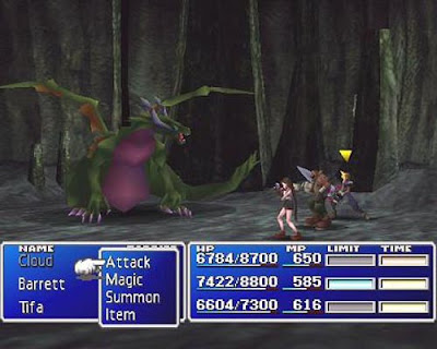
Final Fantasy VII, for the Sony Playstation, was the seventh instalment in a long line of ‘Final Fantasy’ videogames created by Sony’s SquareSoft, which has since merged with Enix Universe to make SquareEnix. All of the games in the series were role-playing games, but FFVII was the first to advance on from the classic 8-bit/16-bit graphics of the previous titles. The game also had a new director and character designer, thus allowing the company to have a fresh start when designing the game. At the time the game was first released in 1997, the graphics were regarded as ground-breaking, as it pushed the limits of the graphical capabilities of the Playstation. Consequently, the company has carried on this graphical speciality to every game they have produced since, and are currently renowned as unchallenged in that area of gaming.
The game story centrals around the young, indifferent protagonist (Cloud Strife) and his quest to save the world from total destruction by the twisted, unstable killer (Sephiroth). Along the way many other characters join Cloud on his journey, bringing the total playable characters to 9, and each of them bring a completely different personality and life story to the table. The insanity of the villain Sephiroth also draws the audience in, as his chaotic desperation to avenge his pseudo-mother drives him to loathe the world. Due to the extreme depth of the storyline, the audience for the game was originally relatively niche as role-playing games were not very popular at the time. It was because of Final Fantasy VII’s quality and complexity of story however, that caused its huge success, as all different audience groups joined together to play what many people still regard as the ‘Best game ever made’.
Years on from the game’s success, the FFVII characters have gone on to make many other appearances, as an attempt by the company to reach out to the huge fan-base for the old game. Some were in other games, and all of them starred in the motion picture ‘Final Fantasy VII: Advent Children’, a film sequel to the game, set 2 years on. There have even been music albums, spin offs in anime, and mobile phone games, meaning the game has spread across all forms of media technology and the company can truly exploit the game for all it is worth. Whilst some fans have qualms with this approach, the majority are more than prepared to spend their money to support something they had a passion for, if not just to see the new media adaptations of the classic characters – greatly improved graphics and voice acting being the major differences.
Key concepts:
- Vertical integration
- Proliferation
- Convergence
- Quality
- Reach


